Wednesday, January 10, 2007

Anime Vector Art

This tutorial will teach you how to make anime cartoons, like the one you might have seen on Pokemon, BeyBlade or DragonBallZ.

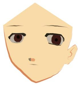
Now let us start! We should remember that the face of these cartoons in generall a triangular shape, and also there ears are like a flipped € sign. So take a pen tool make the following shape and choose the Stroke Path option by right clicking. The thickness of the brush should be around 3 to 4 px.


Next, using the pen tool again, just make any shape over the head of the face. You don’t need to care about the shape, as the hair of the character would later on cover it.

Now for the mouth just make a simple curve pointing upwards and Stroke path this too with the brush thickness as 2px.

For the nose, just make a sort of a flipped triangle in gray color and on the right side of it make a rounded rectangle or a lighter shade than the skin.

The eye is the most difficult part of the whole picture. There is never a definite shape to these ayes but, you can use the below picture to trace them out. You can change the color of the eye according to your choice.

The eyebrow is again a curve with brush thickness as 2px.


Repeat the same process again to make the other eye as well-


The hair that you will make with the pen tool should not be like normal hai whatsoever. They should be pointing in different directions. As you would see now that, that now the triange would get covered up-
Choose "Fill Path" on the pen tool and choose somewhat like a blonde towards golden color for the hair-


As you would see that there are some gapes near the ear of the man. Just use the brush tool to adjust such mistakes-

Once you have done this, add the shadows of the hair usings a darker color. Use the pen tool to outline only a part of eack spike and then fill it with a shade of brown-


Add a cool name and you are done-

Wednesday, January 3, 2007

Skyline Template

First take a photograph of the skyline of the city whose website you wish to make. In this case I have take Seattle. Try to choose a city that has one prominent building. Like Singapore has the Petronas Tower and Agra has Tag Mahal.


Next using the pen tool make an out line of the skyline of the city and fill it with black color. You can also choose any other color of your wish. After that also add a background color.


Now again using the pen tool make the shapes that are shown below and add it between the city skyline layer and the background layer.

Once you have done that you will get something like this.


Just add the other parts of the website and your website is ready! Here have a look -


Saturday, December 16, 2006

Apple Style Banner

This tutorial will teach you how to create and Apple iPod style banner for your own product.

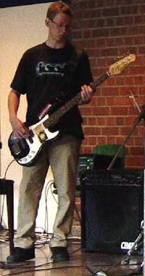
Click a picture that has human using the product. For this tutorial I have taken the product to be a Guitar. We want to convert this -


Into this -


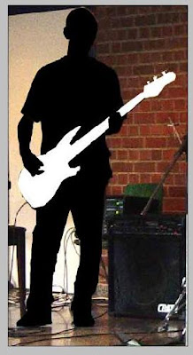
Choose any background color that you like. What we will do first is use the pen tool to make the out line of the person. Draw over the product if it is coming in between. Leave the parts that are coming over the object and now fill the whole path with back.


Now make a new layer over it make the products outline by the pen tool and fill it with white color -


Next make a new layer and make all those body parts that are coming over he product -


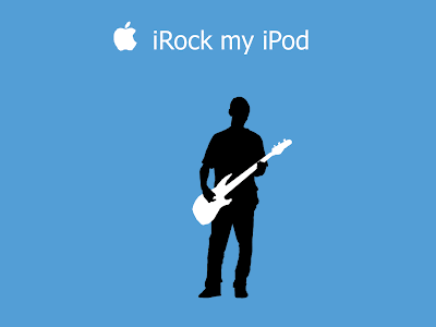
Now, delete that layer that contained the ogrignisl image so that you are now left with only the outline of the picture. Finally just add this image to the background(initially created), add a snazzy caption and obviously the Apple Logo. You are done! Once complete it should look something like this -


Friday, December 15, 2006

Silver Glass

This is tutorial will teach you how to create a sleek looking website design with basic knowledge of Photoshop 7.

Step 1:
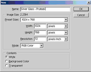
Make a new Photoshop Document of size 1024px * 768px.


Also make the background color as - #E7E7E7.

Step 2:
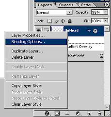
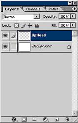
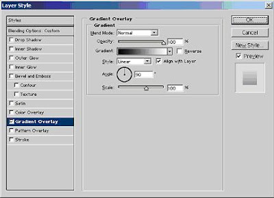
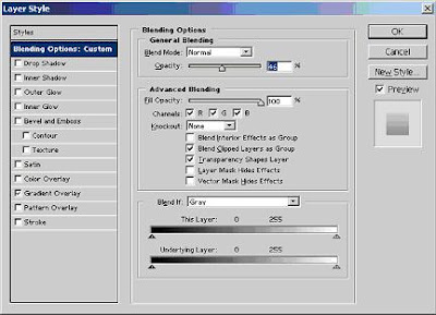
Make a new layer and call it “UpHead”. Then use the Rectangle Tool to draw a small rectangle covering the whole width but in height it should be only 20px-30px. Then assign its opacity as 38% and also put a normal black to white gradient from the blending options.


Step 3:
Now make a new layer called Header. Make a similar box as made in Step 2, which should be just underneath it but much bigger, around 160px to 200px. It should have all the same properties in the Blending Options as was in Step 2. After making that box, it would be looking something like this –


Next make a new layer called Ellipse and by using the Ellipse Tool. It color should be white. This ellipse should be drawn in such a way that half of it comes over the header. It should have the following properties – Opacity should be 46% and it should have a normal gradient overlay with opacity around 90% to 95%.


Once that is done the upper part of the website would start looking something similar to this -

Step 4:

Now you need to make the side bar. I myself have learnt how to make this sidebar from another tutorial that can be found at kenetix.net. Here is how to make the sidebar –

Step 4.1 :
Draw a box lol. I've set the canvas size to 200X300px, you can set yours as anything you want.


Step 4.2 :

Make some modifications to the background, I used #DDDDDD for the background color. Modifications were also made to the rectangle:

- rounded edges

- a gradient has been added (#FFFFFF to #CCCCCC)

- a rectangle outline color of #999999


Step 4.3 :

Add another rectangle in the center of the first rectangle. This rectangle can be any size. I've added rounded edges to this rectangle to give it the smooth look.


Step 4.4:

I added a similar gradient to the inner rectangle. The colors of the gradient are #EEEEEE (you can use #FFFFFF too) and #CCCCCC.


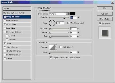
Then, add an inner glow (color: #666666) to the inner rectangle with drop shadows of the following:


Black drop shadow - 125degrees, 1px in thickness

White drop shadow - 315 degrees, 1px in thickness


The drop shadows will give the 3D look to the inner rectangle to make it look as if its encaved into the first rectangle.


Step 4.5 :

Then, draw another rectangle above the SECOND rectangle and give it a background color of #FFFFFF (white). Then, cut the rectangle into the shape similar to the image below and set its opacity to 30%.


For more information on this sidebar please do visit kenetix.net.

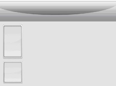
Once you have but two of these side bars your website would start looking something like this –


Step 5:
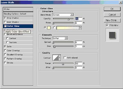
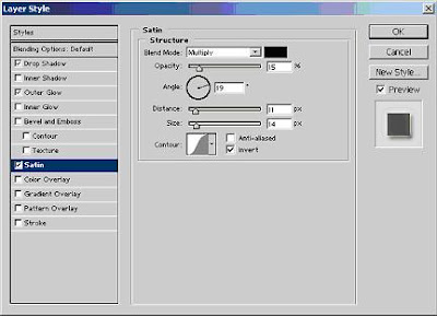
Now you need to logo for this website. For that make a normal circle with color #6699E7. And it should have a the properties –


Once you have completed the following steps you will get something similar to this -

Step 6:
Now make another circle overlapping this one but it should have an opacity of only 21%. Once that is done your logo would be read and would look something like this –


Step 7:
Now all you have to do is add some text and put the logo at the correct place and your website is ready. Once completely finished it would look something like this –